Tag: art

  • Miss La La – Degas and Show Business

    Miss La La – Degas and Show Business

    Miss La La - Degas and show business

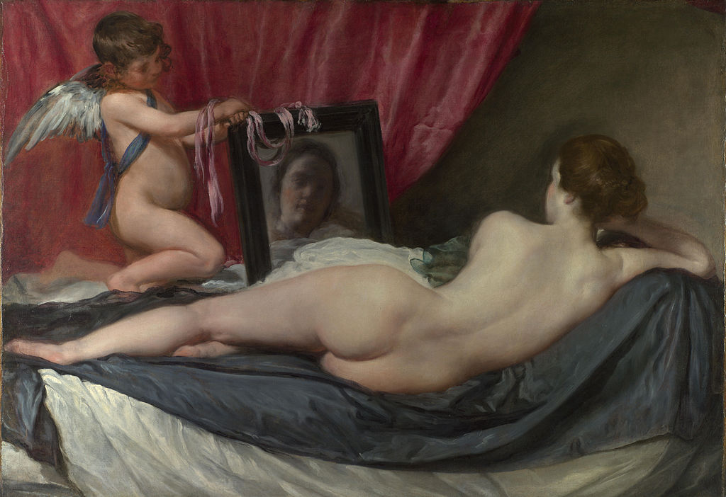
    Edgar Degas (1834-1917) if often referred to as an impressionist. His choice of themes certainly agrees with this observation; he portrays people from dance halls, cafés, concerts, theater. Life on stage is often reflected in his work, but not only its glamorous side. He liked to describe himself as “realist”–a painter whose art reveals the true nature of his objects, not just the impressions they create. Originally, he wanted to be a history painter, but he later decided to dedicate his creative faculties to portraying the modernist spirit in an urban setting.

    Unlike other Impressionists, Degas ascribed much importance to composition. Boldly calculated, his characters–mostly women–are depicted from unique angles, with special reflections of light. As part of his attempt to capture modernism, his characters reveal his observations on the relationships between life on and off stage.

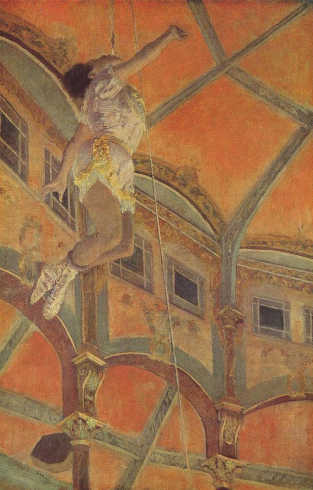
    Miss La La at the Cirque Fernando, created in 1879, depicts a real-life acrobat, Miss La La, performing at the Fernando Circus in Paris. She was slowly suspended 70 feet high in the air from the rafter of the circus dome by a rope clenched between her teeth. Degas was captivated by this performance. For eight consecutive nights, he went to the circus, painting her from different directions (the Tate Gallery has a painting from this series from another angle) until he felt the result fully grasped the essence of her show.

    I find the depiction of Miss La La essentially different from his many paintings of women and the female body. His portrayals of various dancers and women in the toilettes have a pronounced aesthetic quality, pleasant to a layman’s eyes. Not so Miss La La. Though a female performer, she almost lacks the sex appeal so typical of his female characters. She is an abstraction of the woman performer, an emblem of show business in its most simple and unsophisticated form: the circus. A closer examination of this painting reveals Degas’s profound insights into certain aspects of popular show business in the modern age, which prevails in TV shows today.

    The strange angle: The most prominent feature of Miss La La is the angle from which we see her. The spectators are underneath her, looking up, without even seeing her face. This striking perspective is intriguing, and we know Degas planned the composition meticulously, saying “no art was ever less spontaneous than mine.” This painting portrays the show as fantastic, spectacular, utterly remote from real life. The spectators can’t see the face of the performer, but it doesn’t matter. They are not looking for insights into human nature or profound observations on the human condition; they want highly exciting entertainment, a woman clinging to a rope with her teeth, dangling high in the air. Aristotle named “the spectacle” (opsis) as one of six elements of a theatrical performance but felt it was the most superficial one; “spectacle has, indeed, an emotional attraction of its own, but, of all the parts, it is the least artistic, and connected least with the art of poetry.”

    A faceless acrobat: The heart of this performance is Miss La La’s biting the rope with her teeth, yet we can’t see this in the painting. The spectators need to know that the artist is doing something extremely difficult, but they don’t want to actually see the exertion. They want the performer to surmount physical or emotional obstacles, perhaps overcome personal misfortune or a tragic life story, but they have no desire to witness the disappointments, pain, heartbreak, and humiliations. This combination of unseen effort and astounding performance deepens the psychological effect of the show, because it adds a taste of triumph, a feeling of having witnessed some sort of victory. Miss La La’s body floating in the air is light and graceful, revealing nothing of her physical and psychological strain.

    The risk: Circus performance involves a special risk; it is part of their appeal. We know Miss La La was hanging high in the circus dome without any safety measures to save her if she were to fall. Contemporary entertainment shows don’t carry the physical risk anymore, but if you think about such reality shows as Big Brother, American Idol, The Voice, and X Factor, the contestants take the risk of being publicly humiliated, in some cases, and expelled from the show. It may be the case that the audience feels more satisfied, or even aggrandized, knowing that performers are willing to cope with difficult challenges in order to perform on stage.

    Miss La La

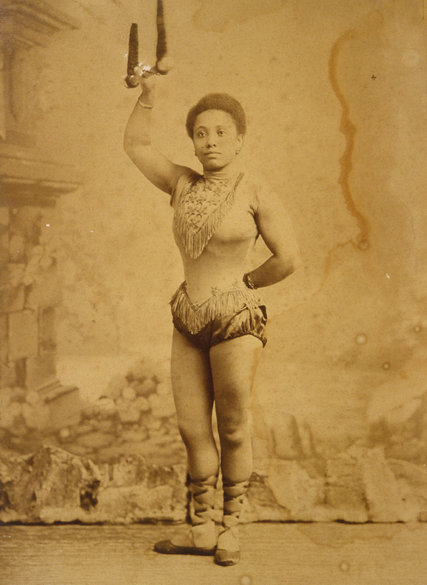
    The black performer: Miss La La is, I think, the only Black woman Degas ever painted. Because he was a profound conservative opposing any social reform (and also an anti-Semite), a black performer must have seemed slightly bizarre to him, perhaps even freakish. From this twisted and racist point of view, portraying Miss La La may refer to a certain tendency to look for unusual performers with abnormal characteristics. TV shows actively seek participants with some sort of bizarre feature and, even “ordinary” participants are often asked to reveal something embarrassing or kinky about themselves.This is not typical only of modern entertainment. The human tendency to peek at bizarre, strange, and sometimes sick people is as old as humanity. Masks of ancient Greek theater represented some abnormal characters; the commedia dell’arte, the first professional theater from the sixteenth century, had some bizarre-looking performers; Victor Hugo depicted The Hunchback of Notre-Dame; and modern films often portray people of “abnormal” body or mind (e.g. Rain Man, Mask). Modern show business, both live and recorded, enhance this inclination since the spectators can see the strange and bizarre in greater detail.

    Now take a look at Susan Boyle’s audition for American Idol – didn’t Degas foresee exactly this kind of entertainment?

  • The Colors of Jerusalem

    The Colors of Jerusalem

    There is something elusive about the Middle Eastern landscape: a blazing sun creates vivid colors, yet the dusty air blurs the contours; desert sand makes the lively hues of rocks, bare hills, olive trees dull and faded. Many European artists have tried to capture the unique light and the peculiar landscape, often perceiving it as a sort of primordial scenery. So different from the European landscape, at times it seemed almost mystical, with its ravines, meandering hills, and arid vegetation.

    Anna Ticho (1894-1980) was an Israeli painter who devoted her life to depicting Jerusalem and the Judean Mountains. Born in Brno, then part of the Austro-Hungarian empire, her family moved to Vienna to enjoy its flourishing culture. Anna often visited the Albertina Museum, admiring the works of Durer and Bruegel. She took art classes and began to draw at the age of fourteen.

    When she was eighteen years old, the Jewish organization “For Zion” sent her cousin Dr. Abraham Ticho, an ophthalmologist, to Palestine to open an eye clinic in Jerusalem. Anna decided to join him on his journey. The cousins fell in love and married.

    When they arrived in 1912 Anna was in a state of shock. The views, the colors, the buildings, the people – everything was so different from anything she had ever seen. She was so overwhelmed by the new surroundings that she could not even express her feelings through art. For four years Anna made not a single painting.

    As WWI broke, Dr. Ticho, a reserve officer in the Austrian army, was sent to Damascus, where he served as a surgeon. He couldn’t find a suitable nurse, so Anna volunteered to be his assistant, an occupation she continued until his death. As the war ended they returned to Jerusalem and purchased a beautiful house in the center of Jerusalem. The lower floor was an eye clinic where Dr. Ticho treated all sorts of patients – rich and poor, high officers of the British Mandate and Jewish immigrants, mainly from Germany – with his wife as his nurse.

    Now, after years in the Middle East, Anna had already grown accustomed to the strange country. She was completely fascinated by the landscape surrounding the city. On the edge of the desert, with buildings covered by Jerusalem stone, Anna walked for hours around the city, trying to capture the unique landscape in her drawings, mostly using nothing but a black pencil. Walking alone in uninhibited areas wasn’t safe, but she wouldn’t give it up. She fell in love with the surroundings. She dedicated her time to both assisting her husband and creating wonderful drawings. The influence of Durer is clearly reflected in her work from that time: delicate pencil drawings, detailed description of the landscape, very expressive. The hills of Jerusalem, people of very different origins, the exceptional light are all found in her drawings.

    Unlike many Israeli artists of this time, Anna did not make any attempt to embellish the landscape or the city. Her art was utterly detached from any Zionist notions. She depicted stony ground, huge thorns, leafless trees, poor people, making no effort to adorn the bare land or soften its bleakness. At times her art seems almost religious – the views seem so primordial that they appear like some kind of pre-human land, almost divine. There is no reference to Jewish or Israeli themes, only a direct unmediated observation of nature.

    In 1960 Dr. Ticho passed away, and Anna decided to leave their home and move to Motza, a neighborhood on the outskirts of Jerusalem, located on one of the hilltops of the Judean Mountains. The view was breathtaking, magnificent. But Anna, following her inner artistic drive, began to paint in her studio. No longer did she feel the need to see the landscape as she portrayed it – now she allowed her recollections to shape her art.

    In the balance between a realistic depiction of concrete objects and a portrayal of an inner experience, the latter had the upper hand now. Anna began to use colors and to experiment with pastels to try and express her impression of the landscape. This withdrawal into the studio, reliance on past impressions, perhaps now more processed, generated wonderful paintings of the views around Jerusalem. Her art now lacked the almost mystic character of the past. It became softer, with greenery and flowers, perhaps revealing more affinity to the land.

    Many immigrants coming to Israel have been overwhelmed by the landscape, so different from their natural environment; not taken aback by ideological barriers or the social obstacles, but simply unnerved by the foreign landscape. Anna, gifted artist that she was, depicted the very slow and sometimes painful process of adjusting to this new geographic region. First came shock and inertia, then an attempt to grasp the strange land through detailed observations, and finally, after containing it, an inner freedom to express both reservation and affection.

    The Old City, Jerusalem 1928
    Ancient Olive Tree, 1943
    Old Woman, 1940
    Landscape, 1960
    Withering flowers, 1975
    Landscape, 1979

  • A True Portrait? Greta Moll

    A True Portrait? Greta Moll

    When I saw the ‘Portrait of Greta Moll’ in the National Gallery I was taken aback. I felt that her character somehow overshadows her artistic presentation: a penetrating look with a touch of humor, a light—yet reserved—smile, curious inquisitive eyes wide open, the feminine roundness of the body leaning almost incidentally against the orange table, impatient, generously allowing Matisse to paint her yet eager to go. She seemed to me so independent and free spirited; in a minute she would stand tall, take her farewell and leave the artist longing to complete the portrayal of her unique character.

    Greta Moll (1884-1977) and her husband Oskar were part of a very small group – ten people at most – of Matisse’s original students. Greta was a German sculptress, painter and author. Her appealing appearance, her free spirit and intellectual and artistic talents captivated the attention of many. Matisse decided to paint her after seeing a black-and-white photograph of a her portrait made by the German artist Lovis Corinth. Looking at the photo he declared, with open contempt, that Corinth had failed to represent her ‘youthfulness’. Taking up the challenge, he suggested he would himself make a portrait of Greta.

    Marg Moll by Lovis Corinth
    Marg Moll by Lovis Corinth

    This was Matisse’s first commissioned portrait. It was painted in the spring and early summer of 1908, in his studio in Paris. Rather pragmatically, he insisted that Greta and her husband should be charged 1,000 francs, but they wouldn’t have to buy the picture if it failed to please them. Portraiture, Matisse knew, is a tricky form of art. It consists of two conflicting elements: a desire to please the subject of the painting, to present him or her in an appealing manner; but also to portray a mood, a state of mind, qualities that might not appear at all attractive. Greta would certainly like to look beautiful. He, however, would venture to unearth her unique quality, perhaps in a way that would fail to appear ‘beautiful’.

    The Portrait of Greta Moll may appear simple, almost as if it was made with a couple of swift brushstrokes. But Greta posed for ten days, three hours every day, until it was ready. Matisse didn’t allow her see the unfinished work. But after ten days Greta and Oskar came to the studio, where Matisse unveiled it. They were full of admiration: Greta’s blue eyes and blond hair (which Matisse used to say reminded him of ripe corn or honey) were pretty, she looked lovely, charming and feminine. The couple, eager to take the portrait, expressed their full satisfaction. Both the artist and the model agreed that the portrait was strikingly like Greta, and the couple went home pleased.

    But not Matisse.

    He felt he had failed to capture Greta’s unique character, “In spite of my best efforts…. I had gone no further than the charming features which were not lacking in my model, but I had not managed to catch her statuesque aspect.” This was all wrong. The more charming she appeared, the more falsified the portrait was. Greta had something overwhelming about her, she wasn’t only ‘a beauty’. And portrait painting is the art of unearthing profound aspects of an individual, an inner world, rare perspectives.

    Matisse wasn’t sure how to fix the portrait. But he recalled a painting he had seen in the Louvre, La Bella Nani, by the sixteenth century artist Paulo Veronese. After Greta and Oskar left he rushed to the Louvre to see it. “The proportions of the model were almost the same as Mm. Moll’s”, he later wrote. Standing facing La Bella Nani he found what had been missing: grandeur, an expressive gesture of the hands, an intense gaze. The freedom of the Renaissance artist to portray drama and intensity of emotions made him aware the limitations of his own work. Naturally he wasn’t going to adopt the Renaissance style; he only wished to extract a certain quality from the painting, and grant it a modern expression.

    La Bella Nani by Veronese
    La Bella Nani by Veronese

    Matisse went back to the study and began working on the portrait. After an hour it was dramatically changed: the woman’s colors and features were intensified, details suppressed, the arms became massive, Matisse had given her a modern grandeur, the “statuesque quality” he was looking for: “abandoning all caution, I worked on it for an hour, perhaps two, ending up with a feeling that I had been most satisfactorily delivered.”

    When Greta and her husband saw the finished portrait they were devastated. She was appalled by the huge arms and the bushy eyebrows. They missed the blond curls and the delicate colors. But they decided to keep it. And gradually Greta connected with herself as she was portrayed by Matisse, and came to love the painting. She was later quoted as saying “I could kill a man who owns it in order to call it mine.”

    I find the portrait overwhelming. And Greta seems to me imposing, whatever her hair, eyebrows and arms looked like.

  • Bewildering female Nude

    Bewildering female Nude

    The perception of the female body is one of the most intriguing and controversial questions of the modern age. Painters, sculptors, photographers have all tried to portray it in insightful and innovative ways: realistically, impressionistically, as an object of desire, as decoration, as an abstract idea; there are endless depictions of nude women, each unearthing a new, unfamiliar aspect. Strange that a thing so familiar – either our own body or that of a partner – remains a mystery that constantly requires explanation. What is it about a woman’s body that evokes this drive to interpret it?

    Henri Matisse (1869-1954), a French painter and sculptor, was one of the artists who shaped twentieth-century art. Active for nearly six decades, he left a huge and versatile body of work. His firm belief that art should constantly be changing made him explore with colors, shapes, light and shade. Often changing his style, and followed by other artists, he was a leading figure in modern art.

    I admit I find his works rather intriguing; people are deeply impressed by paintings that seem to betray a conscious attempt not to gratify the spectators. His works are focused on the process of making art, and at times seem to completely ignore its viewers. They are very expressive, using colors in a unique manner, but not in ways that attempt to please the eye.

    Sleeping Nude on a Red Background was created in 1916. Art historians divide his creative years into periods: the early years, Fauvism, the embattled artist, the time he spent in Venice, the Soviet Union, America, his last years. 1913-1917 were highly experimental years, during which he pursued a radically new and inventive approach to artistic production. It has been argued that during this time he made the most challenging experiments of his career. In 2010 the MoMA and The Art Institute of Chicago held a joint exhibition devoted to these years, titled “Matisse: Radical Invention, 1913-1917”.

    Describing himself, he defined his artistic work as “the methods of modern construction”, not only in terms of experimental techniques but also as a way of defining modernity. What does it mean to be modern? In these experimental years he made various attempts to portray the unique qualities of the modern worldview.

    There is something disturbing about Sleeping Nude on a Red Background. The model’s pose, a naked woman recumbent on a cloth, is consistent with the artistic tradition of a female body leaning against a fabric. Yet Matisse’s model has two conflicting qualities: on the one hand, parts of her are poster-like, lacking any depth. The black hair, the pubic hair and the black object in the back look almost as if they had been made with a black marker. Her body, on the other hand, is vibrant and realistic, in particular her abdomen, which may even suggest movement. But strangely, a careful examination reveals that the colors of her body “spilled” underneath her. It isn’t shadow but an extension of the body onto the sheet.

    Students of Matisse often refer to the innate ambivalence of his work: the past blends with the future, the depth of traditional art is combined with the flatness of modern art, figures of the past mix with the decorative nature of contemporary art. The art historian Alastair Wright argues that “his work sat on the knife-edge between the representational tradition of the nineteenth century and the formalist abstraction to come.” His attempt to define modernism can be extended to include an examination of the modern perception of the female body.

    On the one hand, the sleeping woman is merely an object: the hair and the pubic hair are of the same quality, like something placed there, in the background. She is very beautiful, but still, an object. On the other hand, her body seems so real, almost like an untouched photo of a woman her age, sleeping on a couch. In fact she is so ‘real’ that her vitality seems to spill beyond her contours. The fleshly aspect is very authentic, so sensual that it overflows her body. She is the embodiment of the modern dual view of the woman’s body: as both a sexual object and a liberated person, physically and emotionally.

    I wonder if this ambivalence prevents the eradication of the sexual objectification of women. Is female nude a manifestation of sexual exploitation or of liberation of women? Ambiguity is very difficult to overcome. If a woman’s body was only an object, it probably would have been easier to struggle with it. But this vague, unequivocal attitude – sometimes naked women are merely sexual objects, sometime nudity is one aspect of women perceived as whole human beings – is hard to defy. It certainly is a “modern construction”, as Matisse had put it. And deconstructing it is very difficult.

    Sleeping Nude on a Red Background is exhibited in Kunsthous Zürich.

    This article was posted on the Kunsthous Zürich Museum’s Facebook page on September 22nd 2015.

  • Theme vs. Color: Degas’s La Coiffure

    Theme vs. Color: Degas’s La Coiffure

    What is more important – the theme of an artwork, or the artistic media used to convey it? The idea or state of mind an artist wishes to communicate, or the concrete choices of composition, colors, shapes? The complex relationship between an abstract idea and its materialization in art is a fundamental question in aesthetics; it has been discussed extensively in art history. The underlying assumption of these discussions is that there is a correlation between the two: artists use different tones and shapes to convey content, emotions, beliefs etc. They employ all possible artistic vehicles to create a certain effect.

    In my opinion, in La Coiffure  Degas wished to re-examine this common assumption

    Edgar Degas (1834-1917) was a French painter, sculptor, and also a photographer. A wealthy aristocrat by birth, he could engage in art without needing to attract buyers until the death of his father, after which he had to sell some paintings to cover his father’s debts. He is often associated with impressionism, though certain aspects of his work set him apart from his fellow impressionists – especially the carefully calculated composition of his paintings, and his reservation about painting outdoors. A fine draftsman, a superb portraitist, he was an artist constantly in search for a new creative path, attempting to blur the distinction between genres and mediums. It has been argued that his experience with photography shaped his choice of composition.

    Degas is often described as a ‘reclusive’ person, inclined to aloofness. Though he associated with other artists and was affected by them, it was hard to maintain a friendship with him. Renoir said: “What a creature he was, that Degas! All his friends had to leave him; I was the last to go, but even I couldn’t stay till the end.” A rigid conservative, an avowed anti-Semite, the Dreyfus Affair even further intensified his hatred of Jews. Though utterly remote from the image of an open-minded, tolerant artist, his creative spirit was indeed unique. It reached full fruition in his late years, when he was less inclined to naturalism and more to abstraction. La Coiffure was painted between 1896-1900, and was owned by Matisse.

    When I first saw the painting in the National Gallery I was stunned. The colors are so bright and vivid (though regretfully it is placed is a rather dark room); only rarely does one find such a colorful painting in a museum. Rich orange, red, some burgundy, it is overwhelming. But I also had a feeling that there was some error within the painting – like a coloring book painted without following the instructions. The same orange color was used for the dress of the young women, her hair, the back wall, the drapery, and there is even a stain of orange on her cheek. This choice, of using a similar color for close objects, is puzzling; it stands in contrast with a fundamental artistic convention – the differentiation of objects by color.

    The painting, then, contains both theme and ‘media’, but they are almost unrelated. Thematically, we see a young woman, and an older one – her mother or a maid- combing the long hair of the young one. Strangely, the hair seems almost like an independent being, belonging to neither of them. I would say the painting is about femininity, about who controls the sexuality of the young woman. Degas’ fascination with women combing their hair is well known. But focusing on the colors reveals almost a different painting: everything is orange besides the older woman, the face of the young woman – and the table. The young woman’s hair blurs almost completely into the blazing orange background. From this perspective, the painting is only about the older woman. Was Degas suggesting a social message here? Perhaps about the place of servants? There is no definite answer to these questions.

    The heart of this painting is its double nature. Degas differentiates almost explicitly between images and colors, between two aspects of the painting that are normally fully integrated: the huge bold orange color on the one hand, and the delicate, refined feminine hands on the other.

    Degas is often described by art historians as an “objective painter”: he neither identifies with the objects of his painting nor judges them. He aims at a very precise description of reality, yet one that contains anxieties, feelings, perceptions. That could hardly be applied to this painting, which is rather different from his normal reserved style. One would have to deduce that there is an emphasized element of abstraction here. Perhaps it is not about the brushing of the hair, La Coiffure, but about the process of materializing an idea in shapes and color, about painting itself.

  • Alvin Ailey’s Imaginary Scenery

    Revelations, a dance by the American choreographer Alvin Ailey, is believed to be the most viewed dance performance of our time. People from all around the world enjoy this moving and lively work. Enchanted by the expressive movements, carried away with the music, they are drawn into the world of African-Americans and their journey from slavery to freedom. By the end of the show the audience is extremely excited – much more than in most dance productions. Is this simply the result of an excellent performance?

    Alvin Ailey (1931-1989) was born in Texas to a seventeen-year-old mother; his father deserted them when he was six months old. Poverty, racial segregation, and moving from place to place filled his childhood experience. At the age of eleven his mother moved to Los Angeles and he joined her shortly afterwards. Los Angeles offered better education, and young Alvin revealed an inclination to the languages and arts. After some hesitation he decided to turn to dancing. He joined the Horton School for Dancing, a school with a very particular perspective: all students had to take not only ballet and modern dance classes, but also painting, acting, design, music, and costuming. Alvin absorbed this approach and later made it an important element in his work. In 1958 he founded the ‘Alvin Ailey American Dance Theater’, a dance group combining various dance styles: ballet, modern dance, jazz – and African dance. Revelations, his masterpiece, is founded on his bitter memories from Texas, and more generally, it presents the history of African-Americans, from slavery to freedom.

    When creating Revelations, Alvin strived to reach a holistic theatrical experience. The costumes, the lighting, even the make-up were all part of the dance, as important as the choreography and the performance of the dancers. The movements can be described at an abstraction of the daily lives of African-Americans: a humped slave looking down, people looking upwards in prayer, poorly dressed slaves, women using straw hats, hand fans and parasols to cope with the heat, baptism in the river, a ceremony in the church, slaves working in cotton fields. The mimesis of daily life is very detailed, to the point that typical facial expressions are presented.

    One thing, however, is lacking: theatrical scenery.

    At the back of the stage either a huge sun or a moon can be seen. Nothing more. No picture of life in the south of the United States at the time, nothing constructed on stage to create an illusion of real life in the South — all that is left to the imagination of the audience. Every spectator watching this magnificent work has to use his or her imaginative faculties to reconstruct the circumstances depicted in the dance.

    Of course, lack of theatrical scenery is nothing uncommon in modern dance. The break with the rigid tradition of classical ballet also entailed reservations regarding the pseudo-realistic scenery of well-known ballet performances. Today, digital art is often part of a dance. But all these are entirely different from the daring experimental spirit of Alvin Ailey: presenting history through dance, without scenery to support it.

    The use of accessories – dancers holding parasols, swinging hand fans in different directions, even waving a blue silk cloth on stage to represent ‘the river’ – only further emphasizes the absence of a matching background. Accessories are almost never used by themselves; they match, in form and substance, the general conception of the performance. In Revelations, they are clues; objects that are intended to evoke associations of African-American life without explicitly presenting it on stage.

    The fullest expression of the unique role of accessories is the use of stools in ‘The Day is Past and Gone’, in the third part of Revelations. A couple of women dance while sitting, turning, or standing on stools. The realistic notion created by this very simple piece of furniture is strongly juxtaposed with the lack of a wider context: where are they sitting, why did they meet, when did they meet?

    In omitting what would normally be an essential part of the show, Ailey turns the audience members into active participants: a constant effort has to be made – even if unconsciously – to reconstruct the historical environment of the dancers. The spectators are like readers of a book, who know the plot but don’t know where and when it took place. Thus, the sufferings and joys of African-American history are revived in the most personal and meaningful way.

    In the very last song, ‘Rocka my Soul in the Bosom of Abraham’ the audience goes wild. After reliving the suffering of slavery, bringing the old Deep South back to life, they revel in the liberating message of Gospel music – just like the African-Americans portrayed in Revelations.

  • A Goddess Descending

    A Goddess Descending

    One of the most valued works of art of the Louvre Museum is a gigantic headless statue – almost two and half meters long – of a female figure, with huge wide-spread wings. The figure’s drapery seems animated, suggesting that she is in motion, and the body itself reveals a strenuous movement. The intensity of the figure is overwhelming: she is strong, vibrant, dynamic.

    Nike of Samothrace, also called ‘Winged Victory of Samothrace’, is a marble sculpture of Nike, the Greek goddess of victory. It was discovered in 1863 in Samothrace, an island in the North Aegean Sea, by Charles Champoiseau, a French diplomat and an amateur archeologist. It was headless and armless; one arm was found later, in 1948. The statue is believed to have been created in the early second century BC. Modern excavations suggest that it occupied a niche above a theater, standing on a grey marble structure representing the prow of a ship. The goddess has just descended onto the prow; her wings are still pulled back by the wind. The entire composition most likely commemorated the battle between Rhodes and Antiochus III in the second century BC.

    The sculpture has been on prominent display in the Louvre since 1884. In spite of its immense size it was removed for protection from the museum before the outbreak of World War II. In September 1939 a special wooden ramp was constructed in the Louvre in order to carry this gigantic piece of art to a safer place. During the war it was kept in the Chateau de Valencay, together with Michelangelo’s Slaves and other masterpieces.

    Surprisingly, the Nike sculpture is extremely expressive in spite of it being headless. Though created with a face and body, arms and wings, the body – in itself – is astounding. We tend to think of outstanding images in traditional art as having both face and body. Portraits can also be uniquely moving – but one can hardly find such a passionate image of a headless body. One wonders, what is it about Nike of Samothrace that makes people gather around her, mesmerized, reluctant to walk away?

    The secret of her charm may be not what we see as we look at her, as captivating as she is, but mostly what we do not see: the strong sea breeze Nike is struggling with.

    H. W. Janson, a noted art historian, observes a fundamental difference between Nike of Samothrace and all other Hellenistic sculptures: her surroundings are a part of the sculpture itself. The invisible gust that she is facing is a segment of the statue just as much as is the goddess’s body, or her huge wings.

    Greek and Roman statues are self-contained. Men or women, well balanced and harmonious, every sculpture is a complete entity, regardless of its positioning. Even if several sculptures together form a mythological scene, each can also be viewed as “detached from the background.”

    But Nike of Samothrace is different, argues Janson: “The goddess has just descended upon the prow of the ship; her great wings spread wide, she is still partly air-borne by the powerful head wind against which she advances. This invisible force of on-rushing air here becomes a tangible reality; it not only balances the forward movement of the figure but also shapes every fold of the wonderfully animated drapery. As a result, there is an active relationship—indeed, and interdependence—between the statue and the space that envelops it, such as we have never seen before. Nor shall we see it again for a long time to come. The Nike of Samothrace deserves her fame as the greatest masterpiece of the Hellenistic age.”

    Looking at the Nike of Samothrace, I feel profound awe: the genius of the artist, who instilled such intense movement in this huge rock, seems to me unmatched, even in later periods. The motion – abrupt yet frozen – is stunning: Nike is utterly confident, in spite of her manifested effort to overcome the facing wind; she will descend onto the prow of the ship and declare victory, no matter how strong the drafts are. And I can’t help contemplating what her face looked like: was she serene? Smiling lightly? Did her face betray the struggle with the wind, or was she indifferent to anything besides triumph itself?

  • The Transformation of Bacchus

    The Transformation of Bacchus

    Some of the most interesting works of art are those depicting motion. The attempt to portray a movement in a two-dimensional form of art provides ample room for the artist’s imagination and mimetic faculties. Since the movement – be it a run, jump, leap, fall, or other – cannot be painted while carefully examining a motionless model, the artist must form a mental picture of the motion in his mind and then implant it in the painting or sculpture. Using various means, including body posture, facial expression, straining muscles, clothing angles, an appropriate background, and reference to well-known stories, artists attempt to create an illusion that the painted figure or sculpture is, indeed, moving.

    One of the best-known examples of movement in art is Titian’s Bacchus and Ariadne, painted in 1522-1523. It depicts Bacchus, the Greek god of wine and religious ecstasy, leaping towards Ariadne, daughter of Minos, king of Crete.  Ariadne has been left on the island of Naxos, deserted by her lover Theseus, whose ship is sailing away to the far left. She is then discovered by Bacchus, who is leading a procession of revellers in a chariot drawn by two cheetahs. He leaps towards her; scholars disagree as to whether he is attempting to save her or has fallen in love with her at first sight. He will later raise her up to heaven and turn her into a constellation, represented by the stars above her head.

    The composition is divided diagonally into two triangles: one green-brown, the other blue. In the green-brown triangle we see Bacchus’s bestial followers; the blue triangle portrays the sky, connecting in the right lower corner with Ariadne and her blue dress. And in the middle of the painting is Bacchus in mid-air, leaping from one triangle to the other.

    The picture was produced for Alfonso d’Este, the Duke of Ferrara, who requested that it portray Greek and Roman themes and stories, “largely based on the descriptions of lost classical paintings”. This enigmatic request has been the subject of extensive research by art historians. Scholars delved into the writings of Ovid and Catullus to find the precise source of inspiration for this painting.

    When I saw the painting at the National Gallery in London, I couldn’t help feeling that there was something odd about Bacchus’s leap. I moved from one side of the painting to the other, hoping that a different angle would provide the right perspective; but in vain. Bacchus’s posture seems to me quite bizarre. His upper body is reclined forward in an unnatural way. One would have expected him to be erect in order to maintain balance when his foot touched the ground. Also, the left arm is pointing backwards, an uncommon movement for a jumping man. The left leg is straight, a posture more typical of pushing than of jumping. And the angle of the red cloth around Bacchus’s body suggests that his upper body was moving in a downward momentum, at a sharp angle to the ground. So was Bacchus jumping upward, forward, or downward?

    After many deliberations I came to the conclusion that the only way to explain the strange posture would be to imagine that he is breaking through an invisible screen-like barrier: the upper body is leaning forward to tear it; the leg is straight to support the body while forcefully breaking through it; the momentum, indicated by the red cloth, serves to crack it more easily; and the left hand is pointed backwards probably to make the ripping apart smoother. Even the posture of the head – Bacchus staring at Ariadne’s face – may be seen from this perspective, as also using the head to tear the barrier. Thus, Titian’s mental image was that of a man breaking though something, making a physical effort to tear it and get to the other side.

    Following this hypothesis, the question of the nature of the invisible screen is bound to emerge. What was it that stood in Bacchus’s way, passing from the green-brown triangle to the blue one? Why was it so challenging?

    The ancient Greek gods Apollo and Bacchus are both Zeus’s sons, though very different in their essence. Apollo is the god of order and reason, of harmony; Bacchus (also known as Dionysus) is the god of the irrational, chaos and ecstasy. The barbaric nature of Bacchus’s followers is very clear in this painting. E. R. Dodds, the masterful classical scholar, describes Bacchus: “he is Lusious, ‘the liberator’ – the god who by very simple means, or by other means not so simple, enables you for a short time to stop being yourself, and thereby sets you free … its psychological function was to satisfy and relieve the impulse to reject responsibility, an impulse that exists in all of us”.

    This might explain the invisible obstacle that Bacchus is struggling with. He finds the transformation from an existence devoted merely to satisfying his most vulgar needs – utterly liberated from human responsibilities, almost non-human – to the realm of love and care for Ariadne extremely difficult. Titian understood the complexity of this transformation: he was aware of the barrier that one would need to overcome in order to achieve it.

  • Is Arnolfini Blind?

    Is Arnolfini Blind?

    There are some enigmas that never cease to challenge the world of art history. One of them is a small picture, a masterpiece by Van Eyck dated 1434, often referred to as ‘The Arnolfini Portrait’.  It is generally believed that the man in the picture in a member of the Arnolfini family, wealthy Italian traders who lived in the Flemish city of Bruges.

    Looking at the picture, one cannot understand what the man and the woman are doing; he is raising his hand in a ceremonial manner, they stretch a hand towards each other, not quite holding hands. In addition to the man and the woman, two people are reflected in mirror behind them, and there is a strange huge autograph of the painter: Jan Van Eyck was here.

    Several art historians tried to find a plausible explanation for this portrait. The masterful scholar Ervin Panofsky had published an article at the Burlington Magazine in 1934 arguing the picture is a legal document denoting Arnolfini’s wedding: the position of his left hand is that of taking a wife, and the position of right hand symbolized the act of marriage. The two people in the back are the witnesses; perhaps one is the artist, who therefore signed the picture with huge letters. Other art historians disagree, providing various possible explanations: it is a betrothal, not a marriage; the woman only appears pregnant, but it was a fashionable dress at the time; Arnolfini is granting his wife legal rights; it is another member of the Arnolfini family, since this lady died before the painting was created; this may be a painting in memory of Arnolfini’s wife; this is an unknown wife of one of the Arnolfini brothers; we cannot be sure it is a member of the Arnolfini family. And there are scholars who believe the iconography of the painting has no particular meaning, it is simply a woman and man in an unusual position.

    I saw photos of The Arnolfini Portrait several times; but as I was facing the painting itself, as if often the case, new emotions and observations were created. I had a strong notion that there is a fundamental difference between the countenance of the man and the woman. After many deliberations I came to the conclusion that Arnolfini, the man, isn’t looking anywhere, whereas his wife’s look is rather focused. If I was examining the painting without knowing the various interpretations I would say Arnolfini was blind.

    Following this hypothesis would lead to an altogether different interpretation of this masterpiece: it is a subtle yet apparent description of blindness. Arnolfini is stretching his right hand to his wife without being able to see her hand. Therefore they don’t hold hand as would be expected, but their hands are touching in an unusual way. This is Van Eyck’s artful manner of demonstrating that Arnolfini can’t see her hand.

    The mirror in the back exhibits two people present in the room, yet they cannot be seen directly. Is it possible that Arnolfini himself is unaware of their presence?! Perhaps it is simply a way of directing the spectators’ attention to the question of who can see whom.

    Since it is daytime, the one candle lighten in the chandelier is clearly unnecessary, unless it is symbolic of vision that is lacking. Even Van Eyck’s huge signature, with the strange inscription – that he was there – may reveal a need one feels when standing next to a blind person: to speak louder, to touch him or her, to make noise whilst moving around the room, or, in short, to make one’s presence more noticeable.

    It is true that the painting doesn’t follow the accepted gestures denoting blindness in art: head leaning backward, closed eyes, eyes lacking pupils or irises, using a walking stick. But all these are typical of an earlier time, and even then, there are examples in which blindness can be detected only by a person’s facial expression.

    My father, Moshe Barasch, an art historian, had written a book on blindness in art, titled Blindness. On its place in fifteen and sixteen centuries he says, “Blindness is not a central theme in Renaissance imagery. Neither in literature nor in visual art is much paid to the sightless person… the persons deprived of it are marginal, often nonexistent”. Van Eyck in not depicting a metaphorical blindness or a spiritual one; this could simply be a picture, one could say a modern one, of a wealthy merchant who cannot see

    If, indeed, the man in the picture is blind, what is it that he is doing? If I had to guess, I would say he is anxious of the approaching childbirth, fearing perhaps that the child will be also an invalid. Could he be taking an oath that if the child would not be blind he would donate sparingly to the city or to the church?  His wife seems anxious too, almost fearful of the future. There are two witnesses to this oath, and a signature of Van Eyck. May God give me a healthy baby, able to see the world.

  • Feminine vs. Masculine – The Rokeby Venus

    Feminine vs. Masculine – The Rokeby Venus

    Sometime a work of art becomes implanted in our mind because we find it disturbing. Not that we do not acknowledge its greatness, the artistic grandeur and the stylish finesse, but there is something about it that touches us in an unpleasant way, evoking discomfort, perhaps even anxiety. When I first saw the Rokeby Venus (known as ‘The Rokeby Venus’ since it was part of an art collection in Rokeby Park) I felt some agitation, and simply couldn’t figure out where it was coming from. Venus, as we all know, is the embodiment of love and beauty, and is often depicted in works of art. But the Rokeby Venus, a huge picture covering an entire wall at the National Gallery, created a strange turmoil.

    The Spanish painter Diego Velázquez (1599-1660) painted the female nude in spite of the vehement opposition of the Spanish Inquisition. He created this painting between 1647 and 1651, and was determined to depict the female body in the most realistic and vibrant manner.  In a way, this picture is an attempt to address human sexuality – not in a vulgar way, but through a portrayal of the most exquisite female ideal. Venus, the Roman goddess of love, beauty and fertility, is recumbent on a couch, watching a mirror – two gestures typical of her depiction in art – as Cupid, her son and the god of physical love, holds the mirror in front of her. Though she appears to be gazing at herself at the mirror, her eyes reveal that she is, in fact, watching the viewer.

    Art historians often argue that the distinct nature of the picture derives from its simplicity – it has no embellishments and hardly any decorations. Both Venus and Cupid are portrayed very realistically, a woman and a young boy on a couch.

    I tend to disagree with this argument. Indeed, there are no jewels and accessories, yet the embellishment—almost adoration—of the female body is embedded in the exposition itself: Venus’s naked body is set on a black sheet placed over a white one. The black sheet, as is often noted, follows her body contours. The couch almost evokes an association of a shrine. It seems to me that Velázquez went out of his way to illustrate the beauty of the female body.

    So why did I find the picture so unsettling? After many deliberations I came to the conclusion that it includes two distinct perspectives: one feminine and the other masculine. They co-exist, creating an inner tension, which makes the viewers stare relentlessly at the painting.

    From a masculine perspective, Venus’s beauty is overwhelming. The delicate contours, the rosy undertones, the pale back, the light neck and temple, suggesting purity in spite of her sensual posture, the naked body contrasted with the black sheet – an ode to feminine perfection. This Venus is the embodiment of sublime seduction.

    Yet, examining the picture from a feminine outlook is an altogether different experience. First, there is the mirror. Venus seems unable to look at her body; she is gazing only on her face. Why isn’t her entire figure reflected in the mirror, but only the facial features? To me, it is nearly a feminist declaration: women find it hard to watch their naked body. Endless hours spent in front of the mirror are always about: do the clothes flatter me? Is the makeup right? Can my flaws be seen through the dress? Velázquez is depicting feminine estrangement from simple, straightforward female nudity. Men adore Venus’s naked body, but she is unable to look at it herself.

    To emphasize her inability to look at herself, even when she watches her face in the mirror, she appears to see nothing but a blurred image, with uneven colors. And a close examination of her gaze, which should have been directed forwards, reveals that it is traveling to the viewer. In essence, it is a portrayal of a beautiful woman who is unable to look at her body and face and see its allure.

    And also, her beautiful body is placed on the black sheet as if it were an object. We don’t really see her facial expression, thus her emotions remain concealed. If we ignore for a moment that it is Venus, and imagine, for the sake of the argument, that this picture was created in the 21st century, we would probably perceive it as chauvinistic.

    So which perspective should we adopt? The feminine or the masculine? They are both there, within the picture, evoking two contrasting sets of emotions. Most viewers look at it bewildered, admiringly yet with some unease.  In 1914 an English suffragette slashed the picture with a knife, badly damaging it.

    Velázquez was, I believe, a man ahead of his time. His intricate, complex drawing of female nudity, in spite of the Inquisition’s threats, reveals a desire to address the psychological aspects of female and masculine sexuality, to outline the difference between them. The hazy face in the mirror, with the eyes secretly watching the observer, may well have been one of the earliest manifestations of modern feminism.